In this article
To access the Replenishment Sales Chart
Replen. Sales Chart for all Calculation Methods
Replen. Sales Chart for Average Usage
The Replenishment Sales Chart provides a graphical overview of an item's sales pattern and inventory movement over a specified period of time, and for certain calculation types, an estimated demand forecast. The chart consists of multiple graphs visualizing the sales and inventory movement patterns for the product. It allows you to set filters for locations and variants - if no filter is set, the chart shows the aggregated values for the item.
Further details, like open documents or Planned Sales Demand, can be shown in the chart, too.
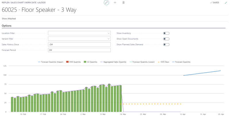
The chart below shows the sales pattern for item 60025 over the last two months from the WORKDATE.
- The green bars show a steady increase in sales until the drop to zero sales in mid-March.
- The yellow triangles indicate that the drop of sales is related to an out-of-stock situation and not to a change in demand.
- The blue line to the right shows the estimated demand forecast trend over the next two weeks from the WORKDATE.
The various graphical information which you can get from the Replenishment Sales Chart are discussed in detail later in this article.
To access the Replenishment Sales Chart
The Replenishment Sales Chart is accessible from the Replenishment Control Data of an item:
- Click the
 icon, enter Retail Item List, and select the relevant link.
 - Select an item from the list to open the Retail Item Card.
- Click Process- Replenishment Control Data.
- Click Navigate - Show Sales Chart to open the Replenishment Sales Chart page for the item.
Replen. Sales Chart for all Calculation Methods
The Replenishment Sales Chart is available for any item with any Replenishment Calculation Type. The chart gives you information about:
- ILE Quantity: A graph of the total item quantity sold over the specified period of time.
- SHA Quantity: A graph of the total quantity adjustments made to the item sales, via Sales History Adjustment, during the specified period of time.
- Aggregated Sales Quantity: A graph of the overall item sales made over the specified period of time. This is the sum of the ILE Quantity and the SHA Quantity.
- Inventory: A graph of the stock at hand for the item over the specified period of time. If you want to view this information, select the Show Inventory check box on the Options FastTab.
- OOS Days: Over the specified period, the days, on which the item was out of stock, are highlighted as OOS Days, represented by dotted marker points.
- Sales: A graph of the total item quantity from the existing sales orders in the system, which are expected to be shipped out over the forecast period range.
- Purchase: A graph of the total item quantity from the existing purchase orders in the system, which are expected to be received over the forecast period range.
- Transfer: This graph works together with the Location Filter on the Options FastTab. It represents the resultant quantity for the item expected to be transferred out from or transferred in to the location over the forecast period range, after taking into consideration all the open transfer orders to and from the location for the period. For example, if 15 units for an item are expected to be transferred in to location S0001 and 10 units are expected to be transferred out from that location for the same day, the graph will show a Transfer value of 5 (15 - 10) for the item, location, and day.
Note: If you drill down from the graph lines for ILE Quantity, SHA Quantity, or the Aggregated Sales Quantity, the system opens the Sales History Adjustment page. There, you can make any required adjustments to the sales history for the item on the fly. You can see the result immediately reflected on the chart under the SHA Quantity for the respective date and, if applicable, location or variant code.
Note: If you want view the Sales, Purchase, and Transfer information, select the Show Open Documents switch check box on the Options FastTab.
The Replen. Sales Chart lets you choose the graphs you want to view, and filter the data to suit your needs using the following fields on the Options FastTab:
| Field | Description |
|---|---|
| Location Filter | This field specifies the location to filter the chart data on. When blank, the chart shows the values for all locations. |
| Variant Filter | This field specifies the variant to filter the chart data on. When blank, the chart shows the values for all variants. |
| Sales History Since | This field specifies how far back from the WORKDATE should the system consider to calculate the sales and inventory movement history. |
| Forecast Period | This field specifies how far ahead from the WORKDATE should the system consider to calculate the demand forecast and the expected inventory movements from sales, purchase, and transfer orders. |
| Show Inventory | This field specifies whether the graph for the item inventory will be shown or not. |
| Show Open Documents | This field specifies whether the graphs for the Sales, Purchase, and Transfer Orders will be shown or not. |
| Include Add. Dimensions Lift Values | This field specifies whether the Additional Dimensions will be taken into consideration or not. If activated, the Dimension Lift Factors will be added to the forecast quantities shown on the chart. |
Replen. Sales Chart for Average Usage
The Replenishment Sales Chart for Replenishment Calculation Type Average Usage gives you all the information, filters, and switches listed in the section Replen. Sales Chart for all Calculation Methods. Additionally, it also gives information about:
- Average Daily Sales: A graph of the average daily sales quantity for the item over the specified period of time.
- Forecast Quantity: A graph of the estimated sales demand for the item over the forecast period range. If the Replenishment Item Quantities exist for the item over the specified period, the estimated demand is derived from its Average Daily Sales. Otherwise, the demand is calculated from the sales history of the item.
- Forecast Quantity (Planned Sales Dem.): A graph of the estimated sales demand for the item, considering any Planned Sales Demand defined over the forecast period range. This is calculated based on the Forecast Quantity value. If you want to view this information, select the Show Planned Sales Demand check box on the Options FastTab. This check box is exclusive for Replenishment Calculation Type Average Usage.
See also
Calculation Type – Average Usage