Working with Panels
In this article
Example - A semi-simple panel: The #NUMPAD panel
Example - a complex panel: The #POS panel
The following examples show how a panel is prepared and created. A panel can have anything from a simple setup to a complex one. Simple panels use only Button pad controls when more complex panels use many types of controls.
The examples exist in the Demo Data.
Example - A semi-simple panel: The #NUMPAD panel
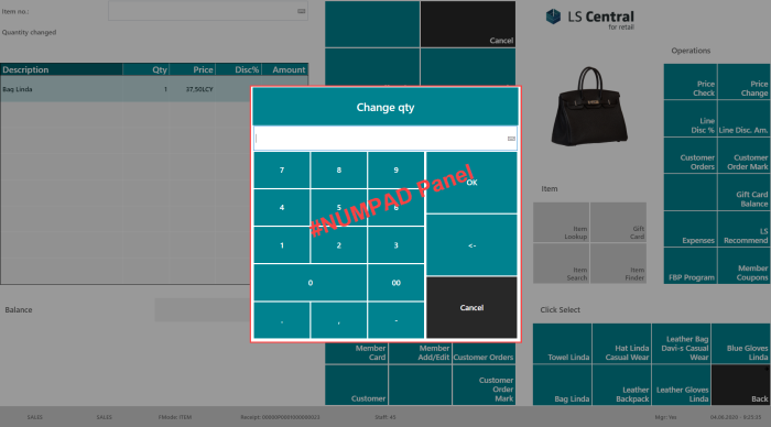
The #NUMPAD Panel is the panel that is widely used in the POS. This panel is an example where two types of controls are used, button pad and input controls.
Step 1
- Define the parts needed for this panel.
- Two parts: the message text and the buttons:

- Define the information needed for each part:
- A menu which displays the Information text.
- A menu with Yes and No buttons.
- Give each part a number.
- Part 1: Information text.
- Part 2: A menu with Yes and No buttons
- Four parts:
- Title
- Input
- Number buttons
- Command buttons
- Define the information needed for each part:
- Title, the system automatically puts in the text, depending on the command using the panel
- Input part, users must be able to put in their quantity.
- Since the POS is usually a touch screen, you need to be able to use buttons to enter the input.
- Commands that the user is able to use in this operation.
- Give each part a number:
- Part 1 for the Title.
- Part 2 for the Input.
- Part 3 for the Number buttons.
- Part 4 for the Command buttons.
Step 2
- Divide the panel into rows and columns, depending on the defined parts:
- 2 columns
- 3 rows
- Give each column and row a number:
- Define the size of the panel;
- Decide the size of the panel, is it a full-screen panel or not?
- The panel below is not a full-screen one, so you must specify its size, length, and width.

Step 3
- Create the panel for the Interface Profile you want it to be in.
- Fill out the fields for General FastTab:
- Give the panel a Control ID: #NUMPAD.
- Fill in the number of columns and rows, 2 and 3.
- Fill in the Width and Height for the panel, in this example the value is %, 35% for the width and 60% for the height:

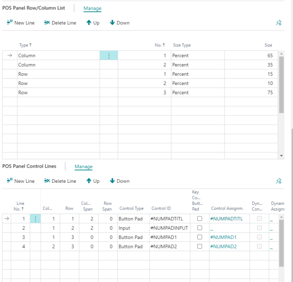
- Fill in the fields in the POS Panel Row/Column List FastTab:
- You see as many columns and rows as were entered in the General FastTab.
- Look at the Size Type for each column. There are different options, an ideal one to use here Percent.
- Fill out Size for the columns and rows as needed and as fits your setup.
- The POS Panel Control Lines FastTab:
- Fill in your lines, one line per part.
- You set the line number example 1, 2, 3 , 4 and so on. In the example there are 4 lines since there are 4 parts.
- Put the parts into the correct column and row.
- For this example, you have to look at the Column Span since the first two lines span two columns.
- Control Type, here you are looking at the controls that belong to Interface Profile.
- Control Type Button Pad is for the menus.
- Control Type Input is for the input field.
- The top part of the panel where the text is displayed. Here you can see this is a Button Pad and it is linked with a menu with ID #NUMPADTITL. This menu is set up with one button and it is the program that takes care of putting in a correct header into this field: when you change quantity, the title is Change qty, when you enter discount, the title is Disc. %, and so on.
Example - a complex panel: The #POS panel
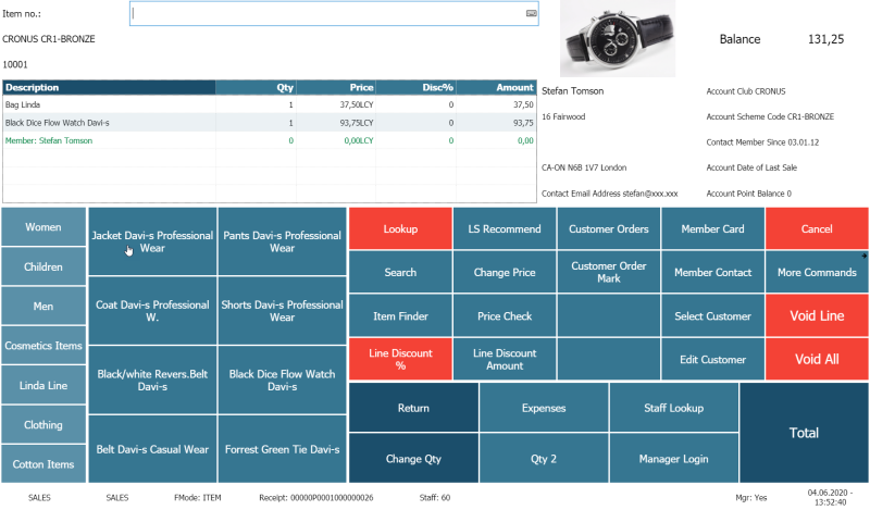
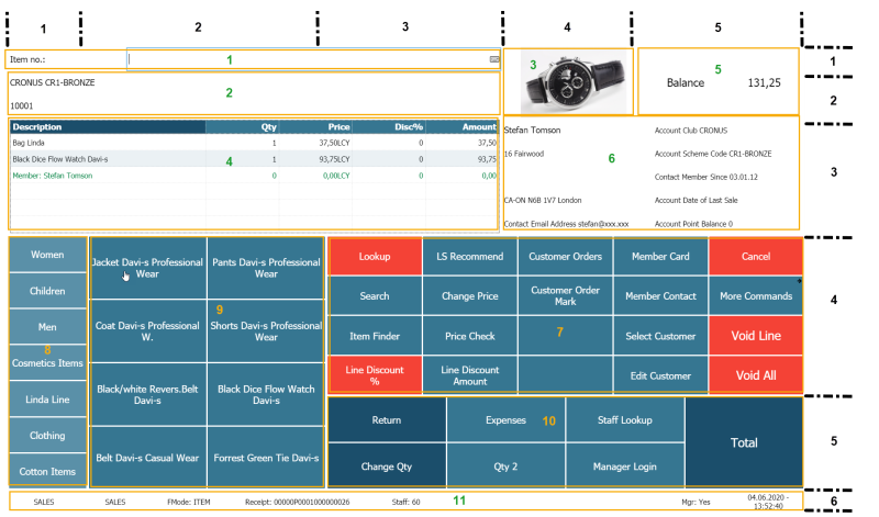
The #POS Panel for Store S0001 with #FASHION2 Interface and Menu profiles looks like this:
Step 1
- Define the parts needed for this panel.
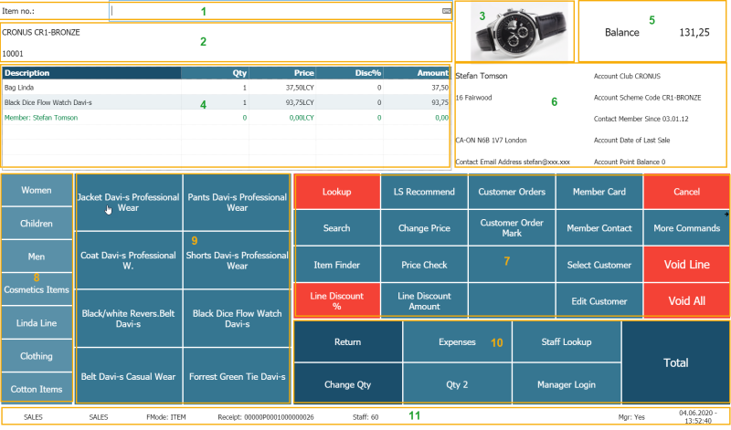
- There are eleven parts.
- Define the information needed for each part and give each part a number:
- 1 - for the Input.
- 2 - for the Information message.
- 3 - for the store’s logo. Images of items can be viewed here as well.
- 4 - for the Journal.
- 5 - for the Totals.
- 6 - for the member/customer information to be displayed.
- 7 - for the Functions - Main menu.
- 8 - for a menu.
- 9 - for another menu, this one changes according to what is selected in menu on area 8.
- 10 - for the Main menu.
- 11 - for the Status Bar information.
Step 2
- Divide the panel into rows and columns depending on the defined parts.
- 5 columns and 6 rows.
- Give each column and the row a number.
- Define the size for the panel; if it is a full- screen panel or not. Note: This panel, the #POS, is usually a full-screen panel
- Check if some parts span more than one column or row:
- In this setup
- Part 1 spans 3 columns
- Part 2 spans 3 columns
- Part 4 spans 3 columns
- Part 7 spans 3 columns
- Part 8 spans 2 rows
- Part 9 spans 2 rows
- Part 10 spans 3 columns
- Part 11 spans 5 columns or all the columns.
- In this setup
Tip: It can be a good idea to print out the layout of the panel and make lines for the needed columns and rows so it will be easy to define each area of the panel.
Step 3
- Create the panel for the Interface Profile.
- Select the Interface Profile ##FASHION2 since this is its POS panel.
- Fill out the fields in the General FastTab.
- Give the panel a Control ID: #POS.
- Fill in number of columns and rows, 5 columns and 6 rows.
- This is a full-screen panel so nothing needs to be entered for the size.
- Fill in the POS Panel Row/Column List.
- Five column lines and six row lines with Size as is in the below image.
- Specify Percent as Size Type as for all lines.
- Figure out the percent size by measuring the size of the parts and convert the size to percentage.
- Fill in the POS Panel Control Lines.
- Eleven lines in total.
- See the how the lines are filled out in the below picture.
