In this article
Data Grid Control Paging Panel
Data Grid Controls are containers for data in row format, including lookups and journal grids. The Data Grid controls are part of the Interface Profile.
- To open Data Grid Controls, click the
 icon, enter POS Interface Profile List, and select the relevant link.
 - Locate your Interface Profile.
- Click Lists - Data Grid Control List (or Related - Data Grid Control List)
Tip: A faster way is to open the POS Data Grid Control directly, but then for a new profile you have to enter the Interface Profile ID manually.
Note: If the Data Grid Control does not exists in your Interface Profile, the POS uses the Data Grid from Interface Profile ##DEFAULT according to the rule with the profiles' setup data.
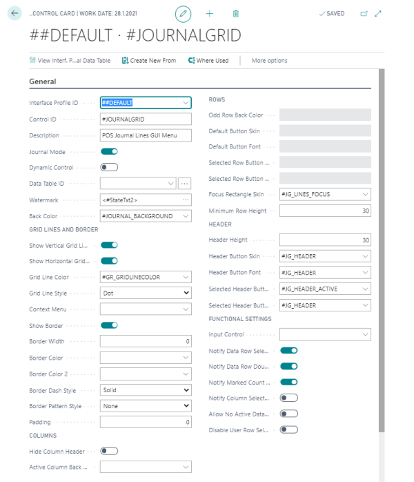
The Data Grid Control Card
 .
.
Data Grid Controls are used for the Journal and for different Lookups, such as Lookup, Item Finder, and Variant Lookup.
- The Data Grids are placed on Panels to display multiple records (Lookup, journals).
- Each Data Grid either has a fixed Data Table assigned to it, or Data Tables can be dynamically assigned to a panel. The Data Grids can therefore be used to display different data, depending on panels.
- For each Data Grid Control there are many settings for how the Grid is displayed in the POS.
- For the Journal, select the Journal Mode check box, and then the setup in the Rows section will be deactivated, since the Journal Lines have fixed font and skin lines, beginning with #SL.
- The Data Grid Controls have Sliding and Scrolling options.
Tip: New Data Grid controls to be used by the system need to be programmed.
Note: For certain data tables, such as the journal data tables, you can assign a POS command to a data table column. For this to work, the data grid control containing the data table must be marked as Notify Marked Count Changed.
Data Grid Control Paging Panel
The Data Grid Paging Panel is set up and defined on the Sliding and Scrolling FastTab:
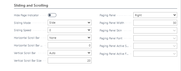
Fields in this FastTab:
| Field | Description |
|---|---|
| Hide Page Indicator | It is possible to hide the page indicator. The indicator is the dots beside the paging panel, one dot represents one page. |
| Paging Panel | A few options to decide the position of the Paging panel for the Data Grid Control. The option None is for no paging panel. |
| Paging Panel Width | Width of the paging panel in pixels. |
| Paging Panel Skin/ Font | These are four fields to assign Skin and Font to the paging panel. |
Note: When the fields Paging Panel Skin and Paging Panel Active Skin are empty, the system looks for a fixed skin value, TA_HEADER and TA_HEADER_ACTIVE. If no TA_HEADER and TA_HEADER_ACTIVE exist, the system uses its own built-in values for the skin color.
Minimum Row Height
The Minimum Row Height field in the Rows section of the POS Data Grid Control Card can set the line in the Data Grid to a fixed value in pixels.
The purpose of this setting is to be able to set a minimum height for the lines. When a Data Grid Control has many lines and small space, the lines automatically use lower space for the height. To prevent this, it is possible to set the minimum height.