In this article
Content and Content Fields FastTabs
To work with card content profiles, click the  icon, enter Kitchen Card Content Profile, and select the relevant link.
The card is used by the customer facing display to show the customers the status of their order. Each order shows one card on the screen. You can design the card to include more information than only the order ID.
The header of the card content profile includes the ID and the Description of the profile.
The Card Columns field controls how many columns of card are displayed in each status column on the customer facing display.
Content and Content Fields FastTabs
The information in the card is organized into a grid of columns and rows.
Before you start adding information fields to the grid, you must define the grid layout of your card.
The No. of Rows field defines how many rows there are in the card's grid.
The No. of Colums field defines how many columns there are in the card.
Example
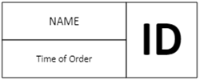
Card consisting of three columns and two rows in the header.
- Name
- Column 1, column span 2
- Row 1, row span 1
-
Time of Order
- Column 1, column span 2
- Row 2, row span 1
-
Order ID
- Column 3, Column span 1
- Row 1, row span 2
Create a new line for each field you want to add to the card. The table below describes the fields in each line:
| Fields | Description |
|---|---|
| WSK Data Type | The fields that can be added to the card have been categorized into the following categories:
The selection in this fields affects which of the following four fields should be filled in. |
| Order Data | This field is enabled if the WKS Data Type field is set to Order data.
|
| Customer Details | This field is enabled if the WKS Data Type field is set to Customer Data. If the order that is being sent to the Kitchen is an eCommerce order, such as a delivery order or a takeaway order that has information about the customer, this information can be added to the card.
|
| POS Tag Transaction | This field is enabled if WKS Data Type field is set to POS Tag Transaction. A list of fields from the header of the transaction. When a POS Tag is added to the card, this information is added to the KOT so it can be displayed on the kitchen displays. |
| Custom Input | If a field has been added to the Data fields list in the KOT, that field can be displayed in the kitchen by entering the name of the field here. Note: The field is case sensitive. |
| Column Name | The text in this field is added as a caption to the data field. |
| Station Font Code | Leave this field empty to use the default style set in the style profile. The default style profile font settings can be overridden per field, for example if you want one field to attract more attention than other information. The font includes the font's size, weight, and style. |
| Station Skin Code | Leave this field empty to use the default style set in the style profile. The default style profile skin settings can be overridden per field, for example if you want one field to attract more attention than other information. The skin includes the background color of the field. |
| Alignment | The default alignment set in the style profile for the card can be overridden per field. Select alignment for the column, left, right, or centered. |
| Column No. | Enter the number of the column this field should appear in. |
| Column Span | Enter how many columns this field should span. |
| Row No. | Enter the number of the row this field should appear in. |
| Row Span | Enter how many rows this field should span. |